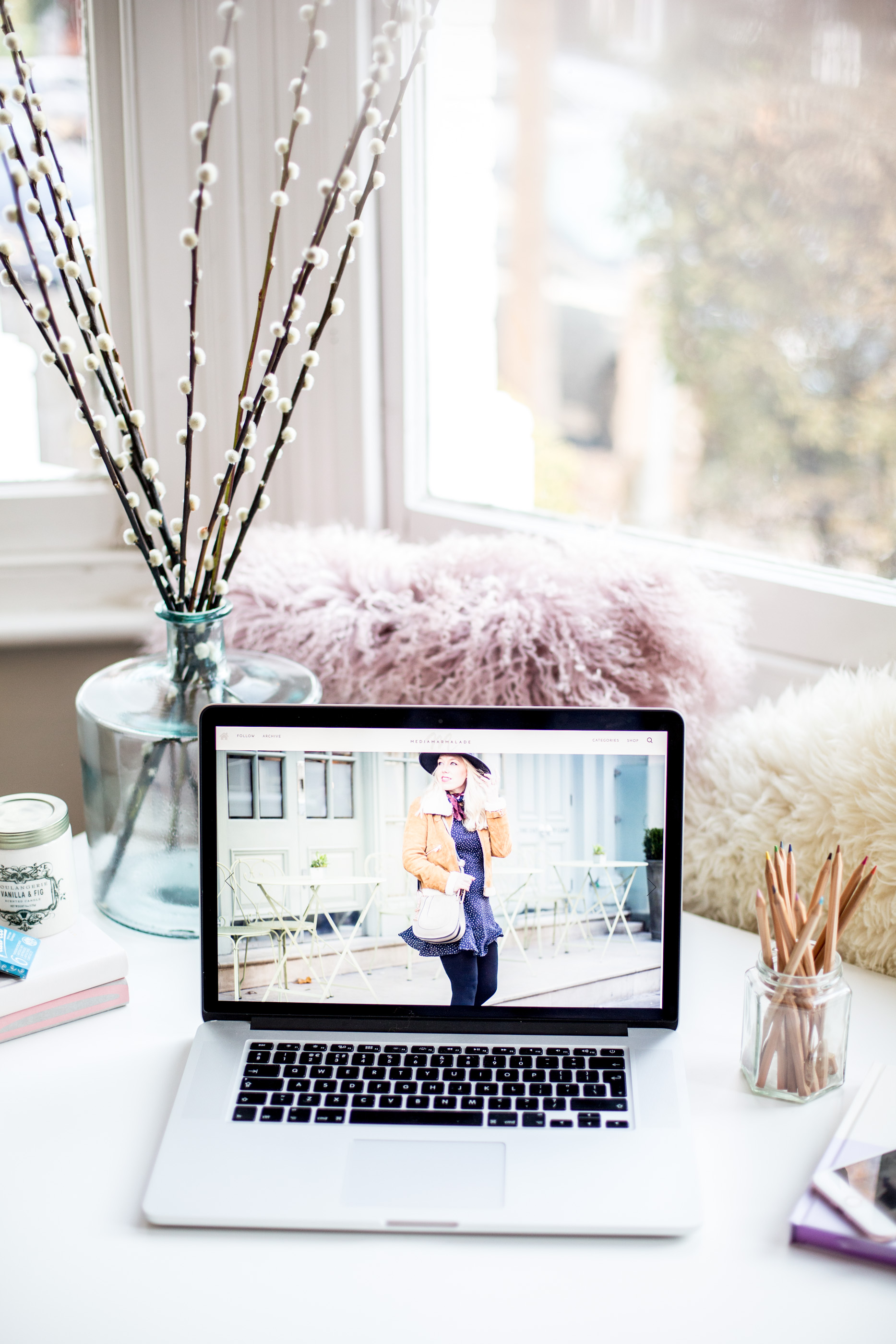
Welcome To The Brand New Mediamarmalade …
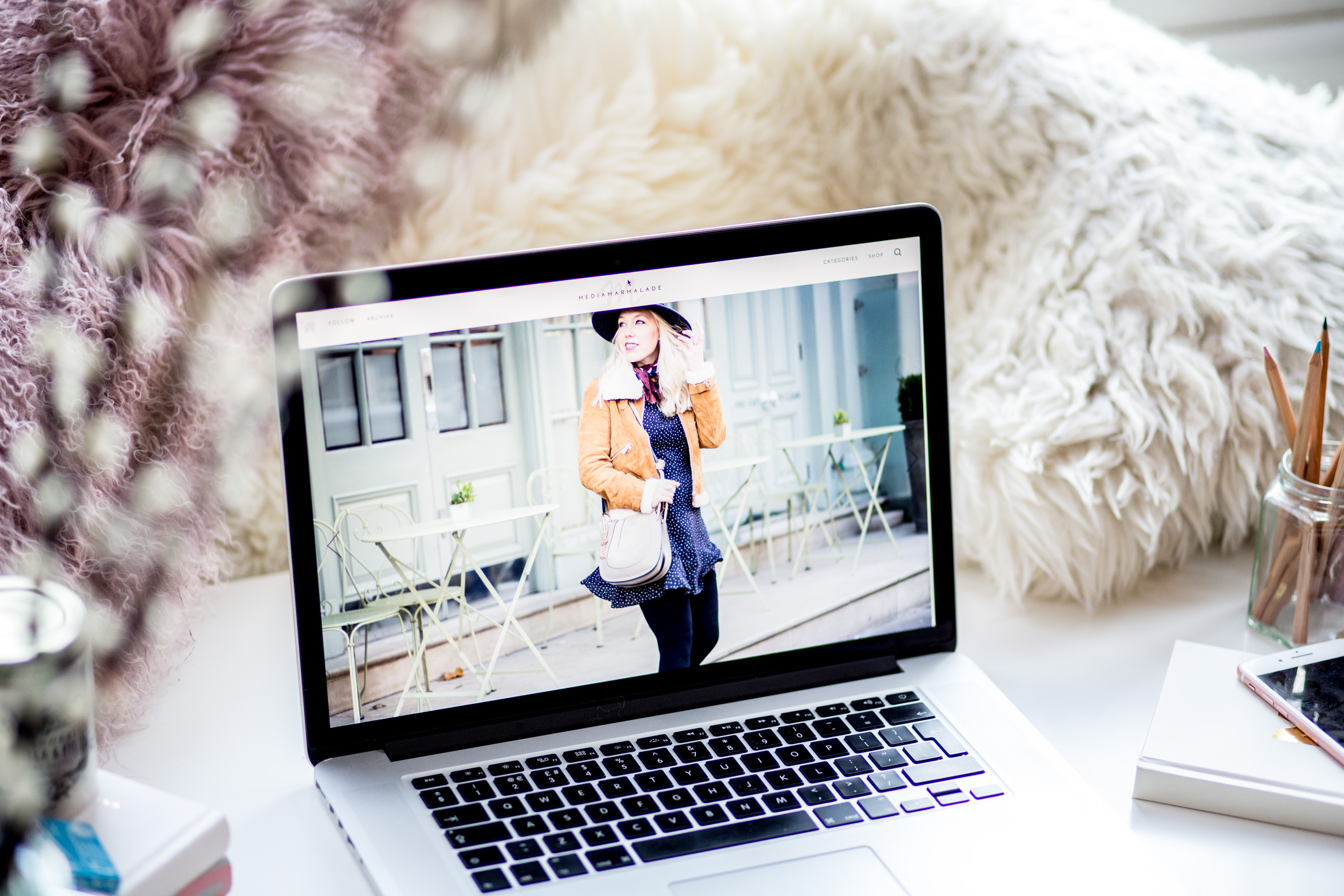
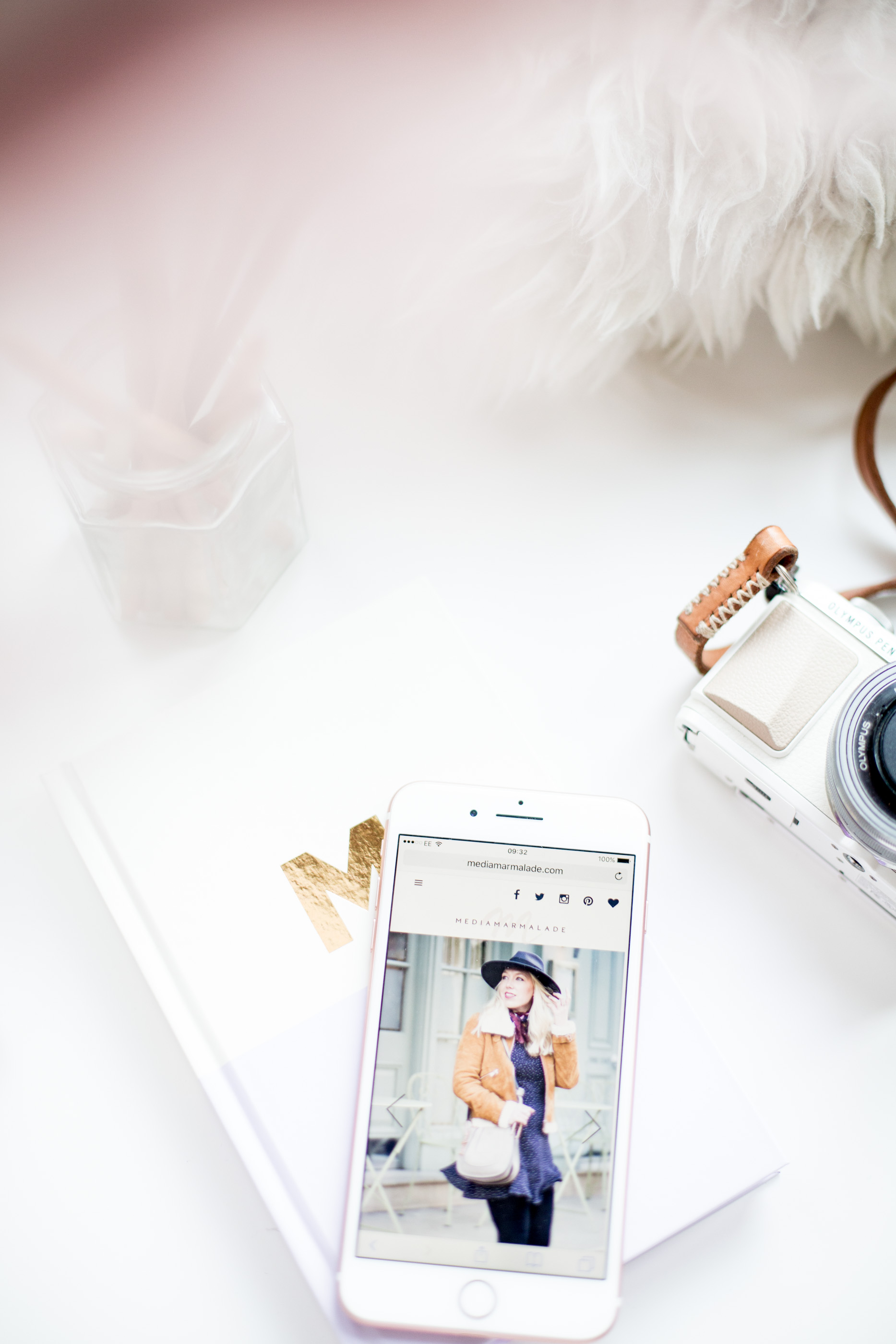
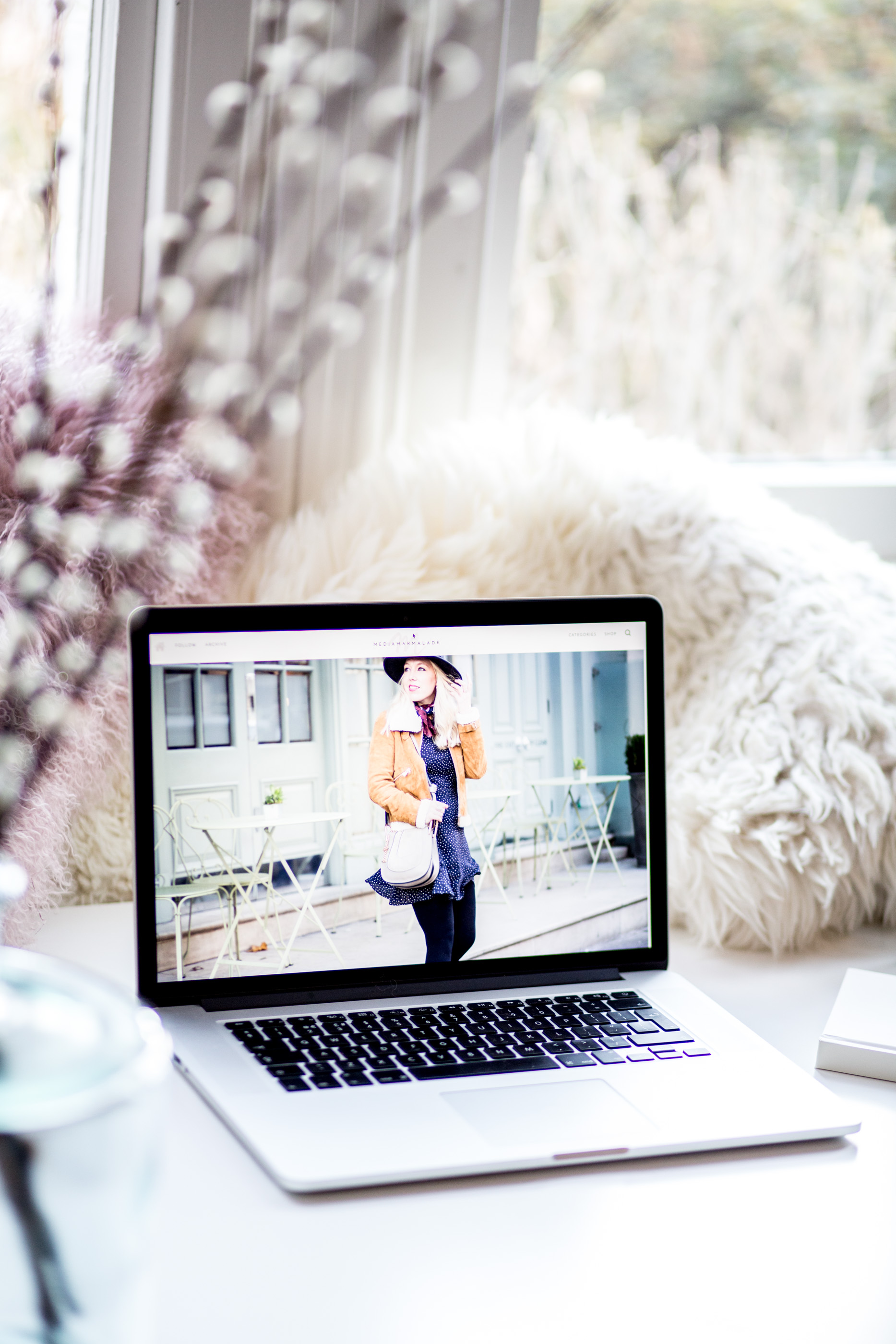
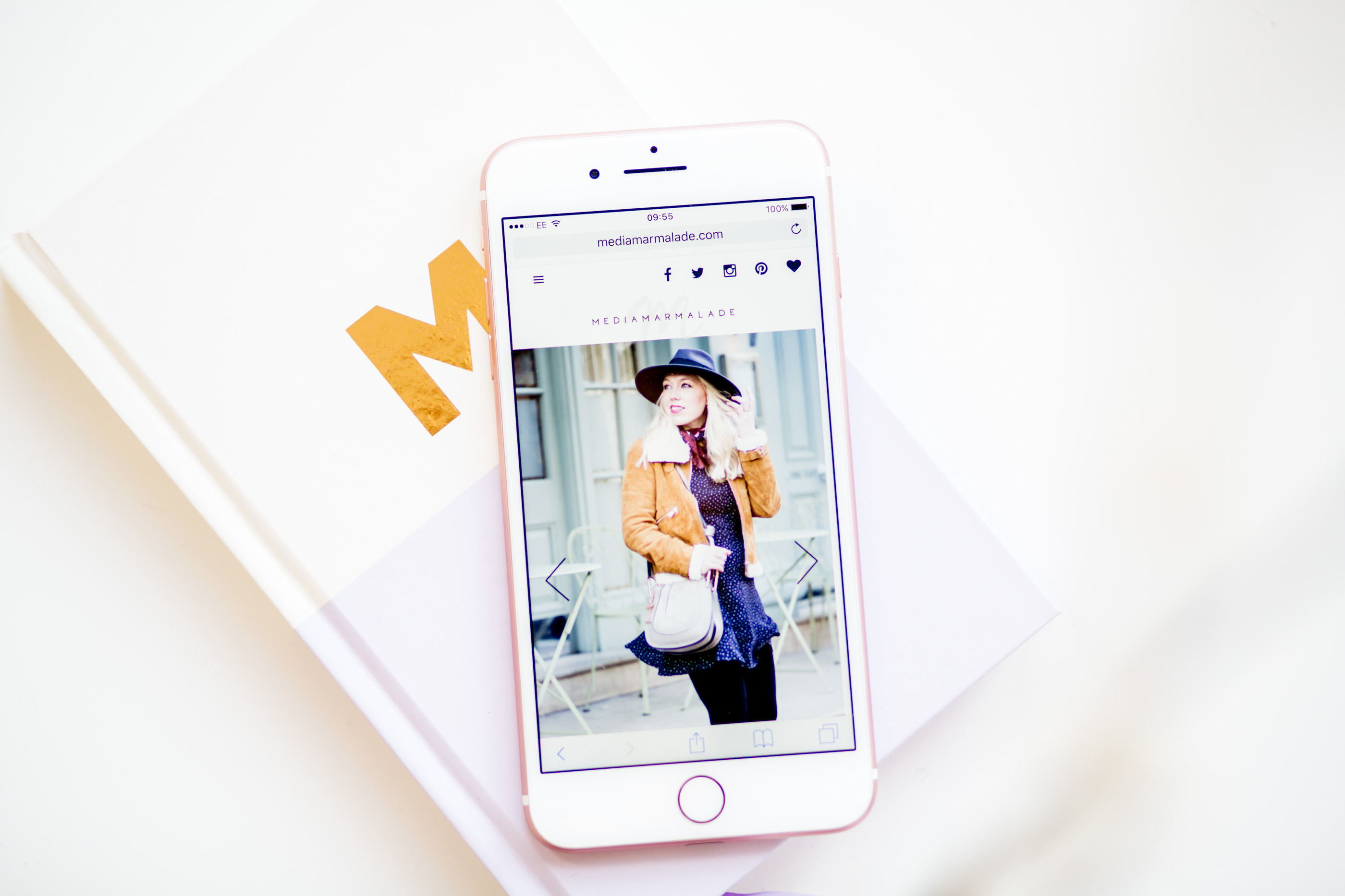
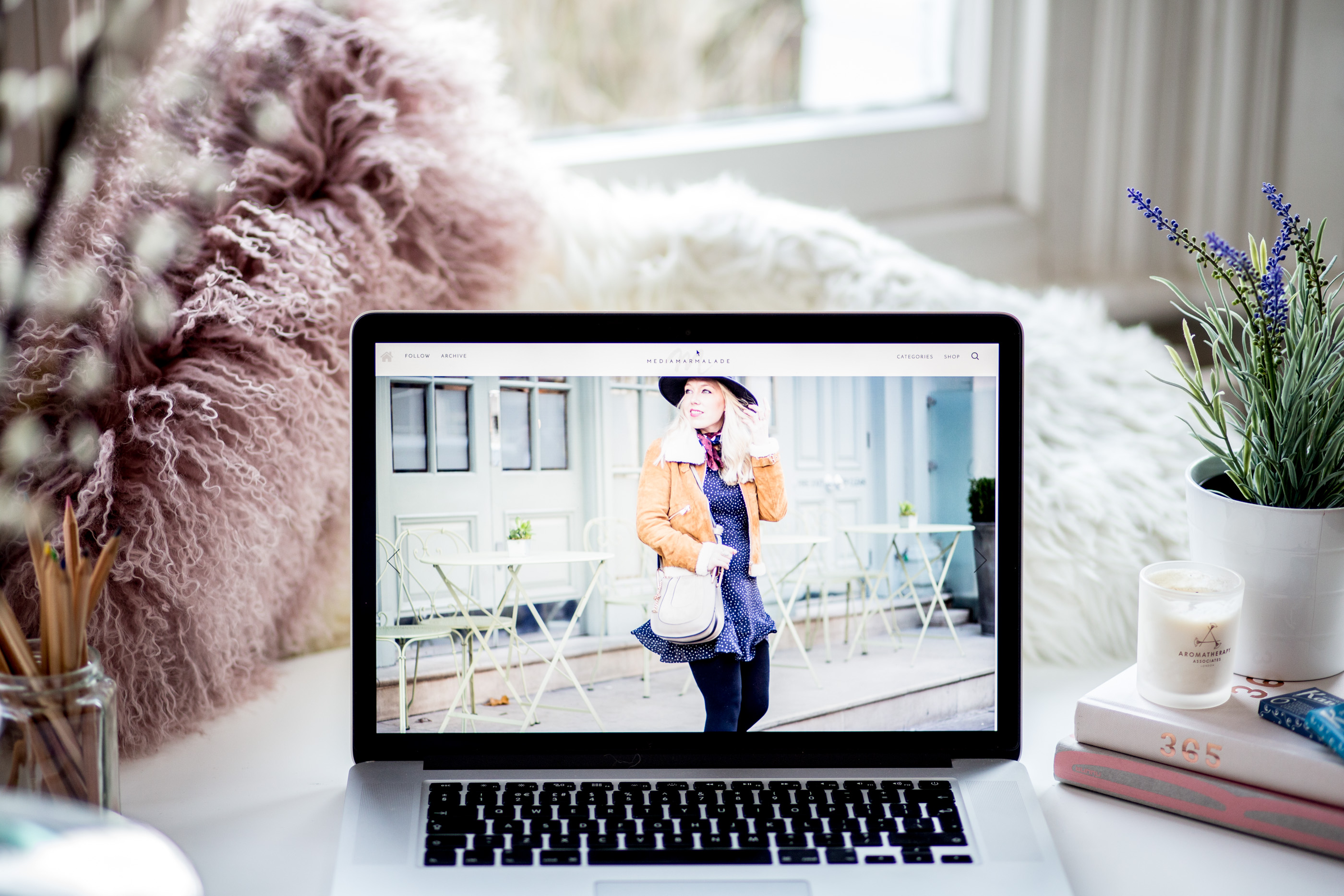
It’s been a year in preparation, but i’m delighted to finally introduce you to the brand new mediamamalade.com. The site and brand has had a huge overhaul, my ambition was to make mediamarmalade.com an inspiring destination for you to explore, discover and enjoy our content more easily.
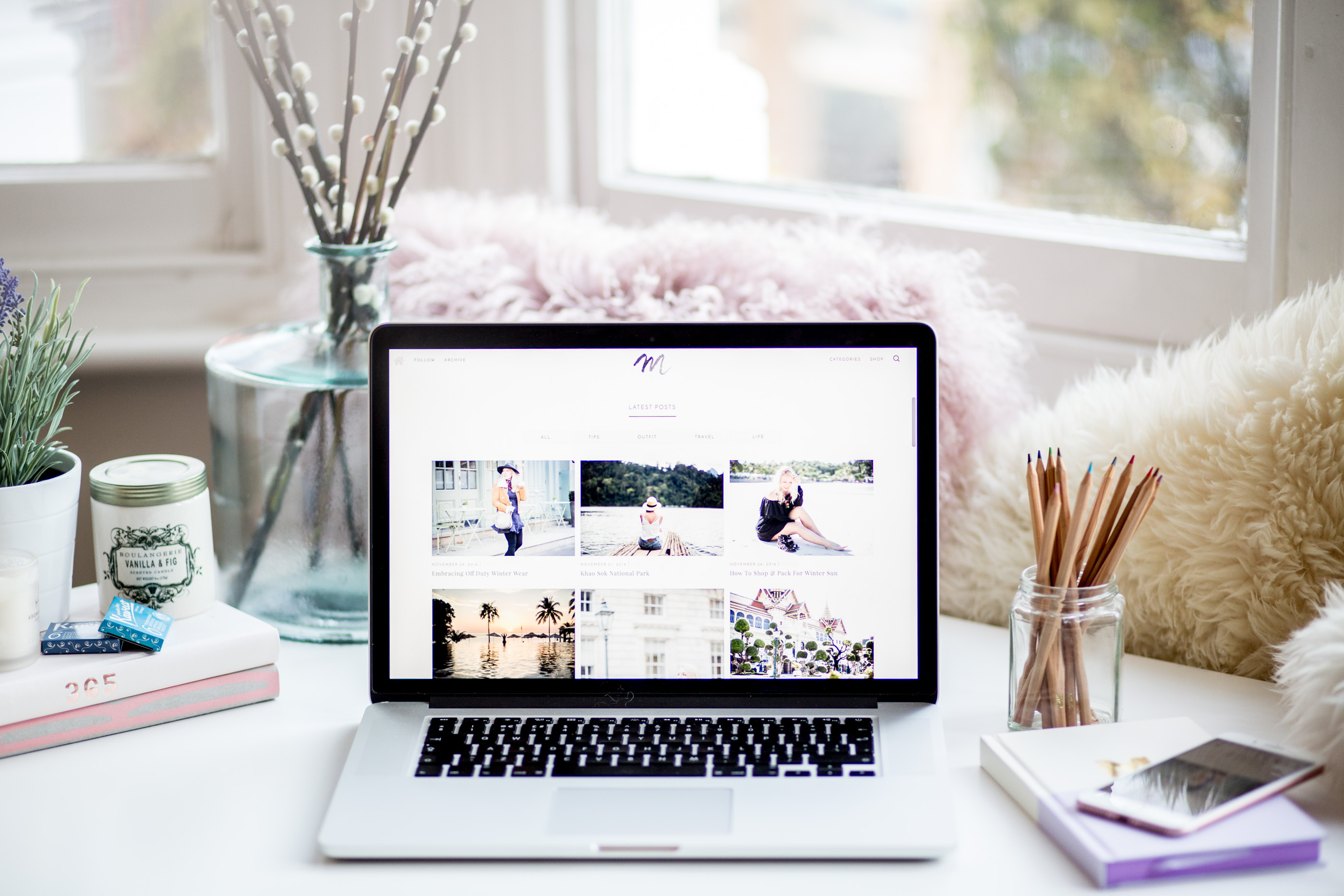
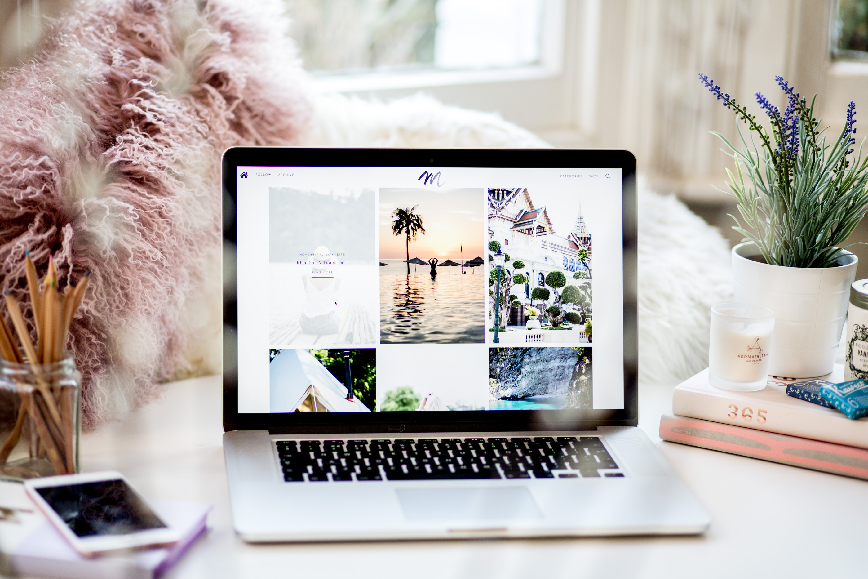
The design is something i’ve been working on since this time last year (in fact a relaunch has become quite the annual affair), I really wanted to make the website feel more like an online magazine and really showcase the thousands of posts that are lurking in the archives. I wanted photography to be central to the design as it always has been, and I wanted you to easily browse style, tips or travel dependent on the content you love and want to see.
Overall I just wanted to shift mediamarmalade.com forward.
My last full design overhaul was back in January 2015 when I moved from blogger to wordpress and completely relaunched mediamarmalade, the move was hard and I spent the year trying to make mediamarmalade reflect my visions, in January 2016 I properly revamped my branding (the logo you’ll all be familiar with now) & gave my site some subtle updates. But as we move into a new year again, the industry continues to boom and my blog continues to grow and evolve into something more, I felt it time to have an entirely fresh start and set myself up for the future. I wanted my sites look and feel to reflect my brand, I wanted the functionality to feel professional, slick and to really showcase the content I pour so much energy into, and importantly I wanted everything to reflect what mediamarmalade is all about:
Mediamarmalade is the destination for the stylish, the ambitious and the passionate. From luxe travel, to seasonal style inspiration, to blogging and career advice, mediamarmalade is a hub of daily inspiration, motivational content, advice and tips, guiding your journey to sartorial, life & career success!
I really hope you enjoy the new site, you love the new logo and branding and that you too feel a little excited about what the future holds for mediamarmalade.

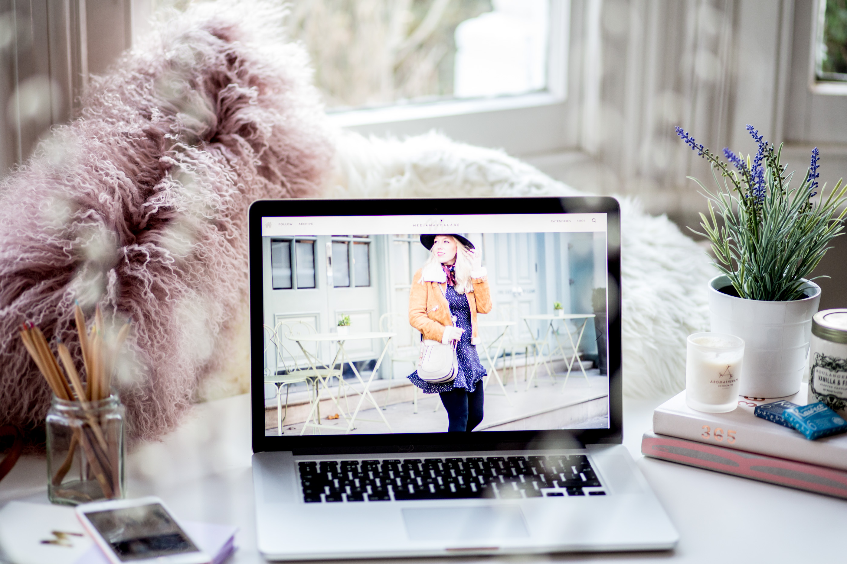
SO WHAT’S NEW?
Discover More
When I carried out my survey earlier this year it was super clear to me that some of you love to visit mediamarmalade for my everyday style features (most of you have been reading since the beginning and just love the original content mediamarmalade was known for), others of you, mostly you bloggers, have discovered mediamarmalade since I started sharing my career and blog tips back in 2014, and for you, these are the posts that you want to read and learn from. For me both are huge passions and I didn’t want to neglect either but I had to find a way to ensure that for both types of reader, the experience still felt enjoyable and relevant.
So when I designed the new home page functionality, it was with this in mind, I wanted to ensure you could browse the posts you were most interested in easily so that every time you visit you feel like there’s something perfect for you to read. The home page magazine grid really allows you to filter to the content you want to read without any time spent searching or getting lost.
What’s Hot
And on top of that I wanted to ensure that you could easily discover older content, just because its not brand new to the site doesn’t mean it wouldn’t be new to you, so that’s why we’ve added a very chic popular posts section and trending feature. My incredible web designer Chaitra (who’s been on this journey with me for 6 months now and who I couldn’t have done this all without) was able to build this special live feed of my ‘top 10 popular posts’ for you to easily browse and scroll through, helping you easily discover something new. I love this slightly jazzy functionality and I think it’s a fab way to easily browse the best of the archives.
Travel Inspiration
In addition to style and tips I really wanted to start sharing more of my travels with you, something that is another huge part of my life but not something I’ve really focused on in the past from a content point of view. I’m fortunate enough to travel very frequently, both for work and pleasure, and I always kicked myself for not sharing more of those trips with you all. Hopefully you’ve already started to enjoy some of my travel posts in the last 6 months from staycations in the UK, to exploring Thailand, to summer vacations in Greece & Cyprus? As travel is a huge passion of mine, I wanted to give the travel page a little spruce up, so thanks to Chaitra, we now have an interactive map that you can easily browse and navigate to seek the destinations you’re interested in looking at.
Shop, Shop, Shop
The shopping pages have always been a little neglected on mediamarmalade.com, they were updated regularly with new things for you to browse and buy, but each shopping category had it’s own page which wasn’t the most friendly to use. Now we’ve made a swanky new shopping page where you can easily browse and filter products based on your specific shopping desires! You’re welcome.
The Logo
The mediamarmalade logo has always been somewhat iterative. If you can remember back 5 years you’ll know how far the logo has come on. Regardless of what my logo has been though, it’s always been custom made and hand created by me, my partner or this time Chaitra. Having something bespoke to mediamarmalade was and still is exceptionally important to me.
I’ve constantly grappled with my logo, it’s changed 3 times since I launched, most recently in January 2016 when I finally modernised the look and feel of the logo with a hand created typeface. I always had so many lovely comments about my logo, which meant so much to me, especially because my boyfriend designed it. But with a fresh start in planning, I wanted the brand to have a completely new look and feel, and I really wanted my logo to reflect the new brand and design.
It’s been a long, long, long process getting to where we are today. I’ve changed my mind a million times in the last 6 months, i’ve tweaked, updated and entirely started againwith the logos we’ve been working on, never feeling quite happy with it. I wanted a hand drawn illustrated font (I basically want Garance Dore to draw me a logo), but none on the table were the ‘perfect’ one (Jase says i’m the worst client). So after much deliberation it was clear to me that perhaps it was time for something simpler.
I have grown, my blog has grown, and I wanted something that felt professional as well as friendly and welcoming. My new logo is the best of both worlds. it’s simple. It’s Professional. But it still has a touch of illustration with the water colour M that Chaitra hand painted for me. I really hope you like it?
Don’t forget to subscribe to mediamarmalade for all the latest style, travel and tips features
. Bloglovin’ . Newsletter . Instagram . Twitter . Pinterest . Facebook .
Overall the site has come on leaps and bounds, it’s reinvigorated my passion for my blog and business, it’s provided me with the professional, classy and inspiring set up i’ve so desperately been trying to create and I really hope it gives you something you enjoy spending time on.
I have huge ambitions for mediamarmalade, and i’m so happy to be taking a big leap towards the future today, and even happier that you’re here for the ride. Thank you. It really truly does mean everything.


The new website looks amazing, well done!
Rachael xx.
theteacozykitchen.blogspot.co.uk
This is fantastic! I love the new template and it just makes your photography and lovely posts stand out even more! I have been reading your blog since 2011 so it is so nice to see how it has grown with you and all these lovely changes :)
I am in the process of re-branding and turning my blog into an online magazine as well and it has been so hard doing so while working at the same time. The template designing took 3 months of meetings with the web designer and it is still work under progress and then it takes aaaages to transfer everything from blogger to wordpress, plus manage the team of authors I got. It is an exhausting work but I love it and I cannot wait for the end product!
xx
It looks so so so clean!
I love this new look. It is so clean and fresh. Xx
Oh my goodness, this looks incredible! I’m in love! Very proud!
Your site looks beautiful!
– Charmaine
http://charmainenyw.com
Love the new look! Nothing like a refresh to make you feel more motivated with blogging :)
Ella xx
http://www.ellaryder.com/
I love the new layout! It’s so fresh and clean and your images suit it really well!
http://www.wheresmylipstick.com
LOVE the new look – it’s gorgeous! I’m so excited for the future and what’s to come. Really really looking forward to some more travel posts! Xxx
Amazing blog! It’s really nice to „read you” :) cheers!
This new website is fantastic! x
Jessica — NinetyCo