A NEW MEDIAMARMALADE
A Refreshed Design For Now & The Future. Mediamarmalade 4.0 (I Think)
I think this may well have been my longest hiatus from blogging yet, and trust me when I say it made me anxious, but it was all in the name of good.
If you’ve been a long time reader then you know I always like to keep my blog design fresh and spend a lot of time and energy making sure everything is perfect on this site. I had a pretty big design update that was a long time coming at the end of 2016, and after a year or so I was eager to make some more design changes to reflect what I want my blog to be now and in the near future.
The latest design changes aren’t hugely major, but they’re things I’ve been working on since late last year, I’ve spent hours doodling and drawing the various updates I wanted to make and debating all the little tweaks with those closest to me, ensuring that every update was an improvement and something people would love. And finally, we’re here, the design has been updated with just a few very subtle changes that I hope make quite a big impact.
It’s been about 9 months of waiting and sorting everything, but I think we’re officially on Mediamarmalade 4.0 (or more likely 8.0 if we count all the tweaks I’ve made).
WHAT’S NEW?
PHOTOGRAPHY
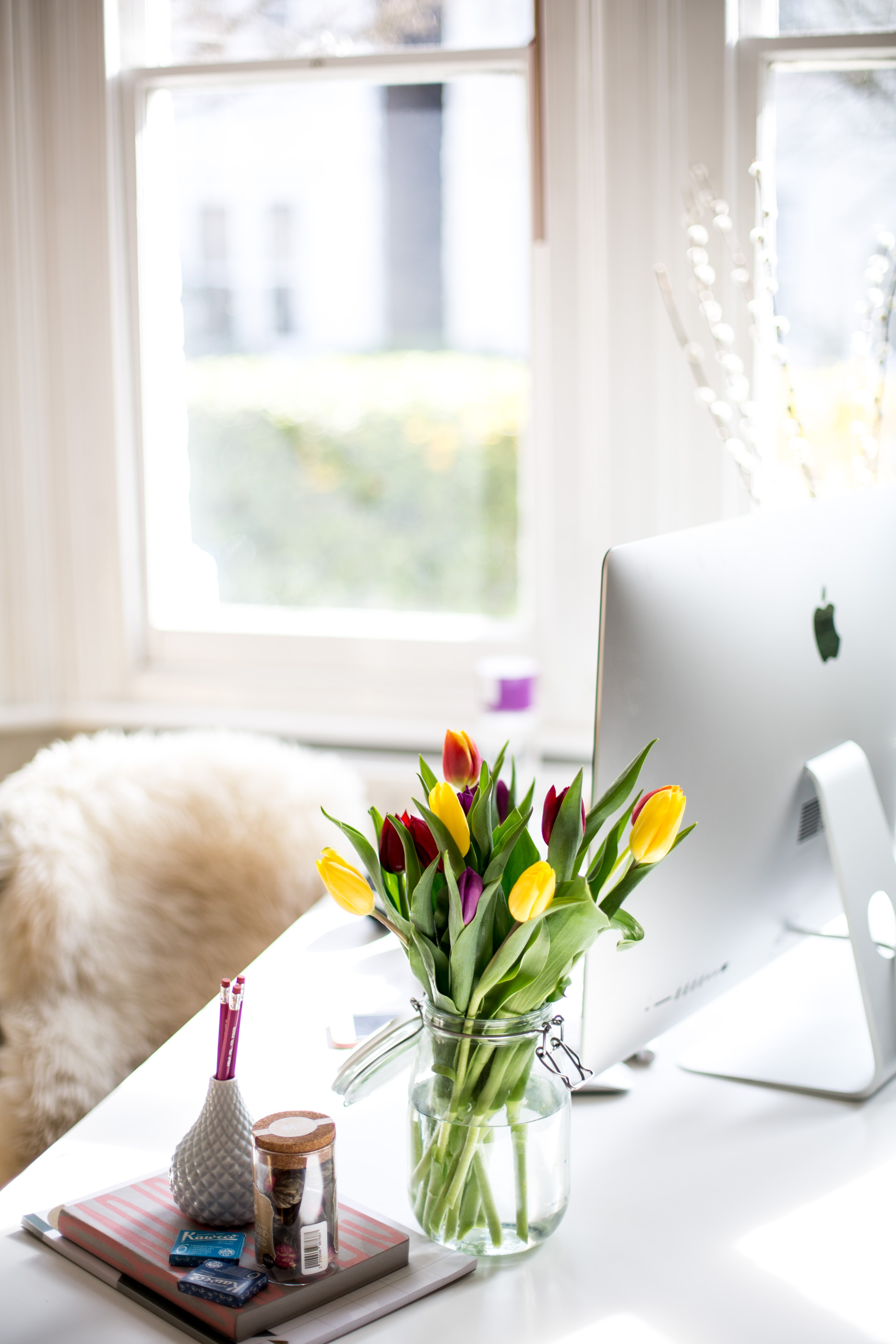
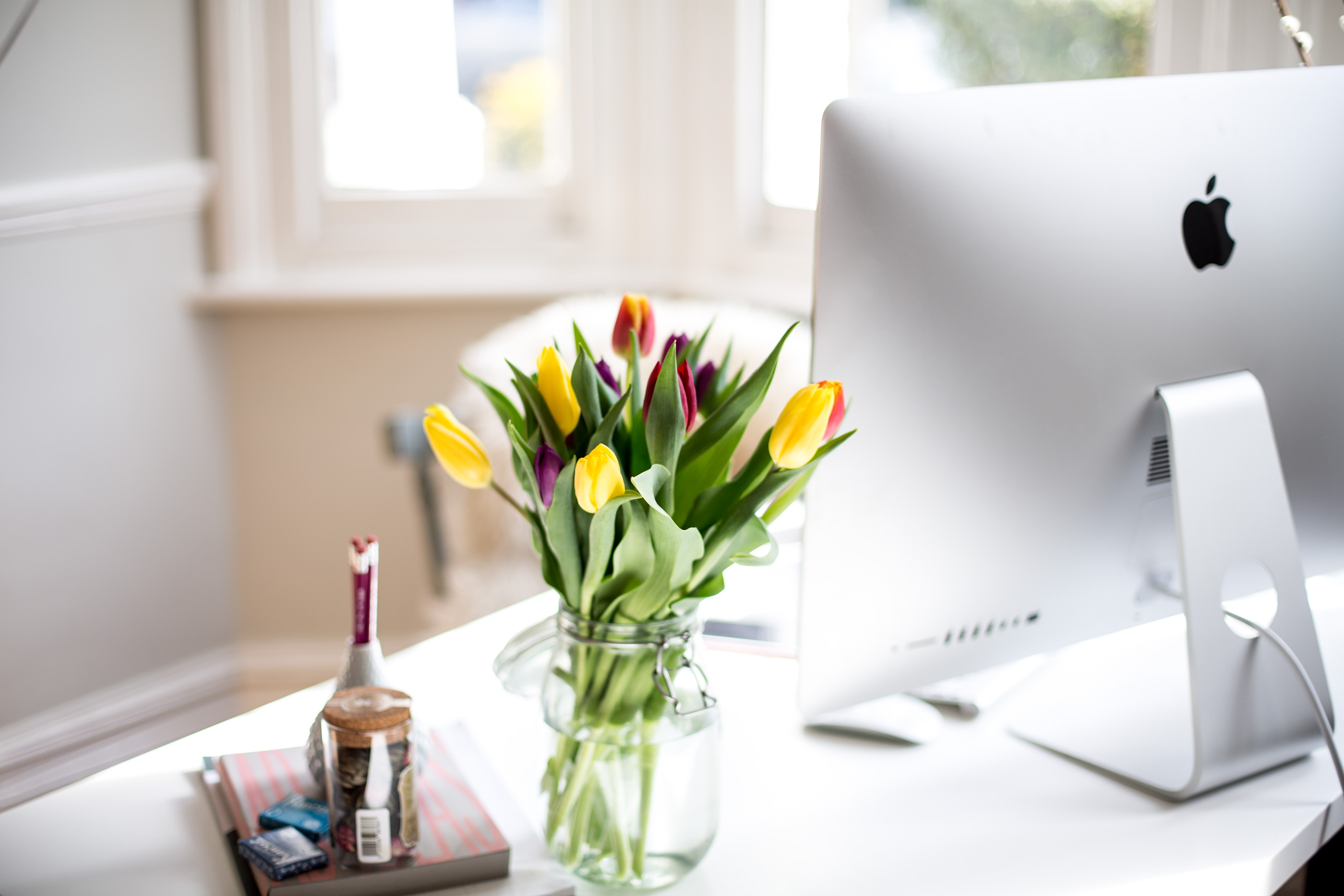
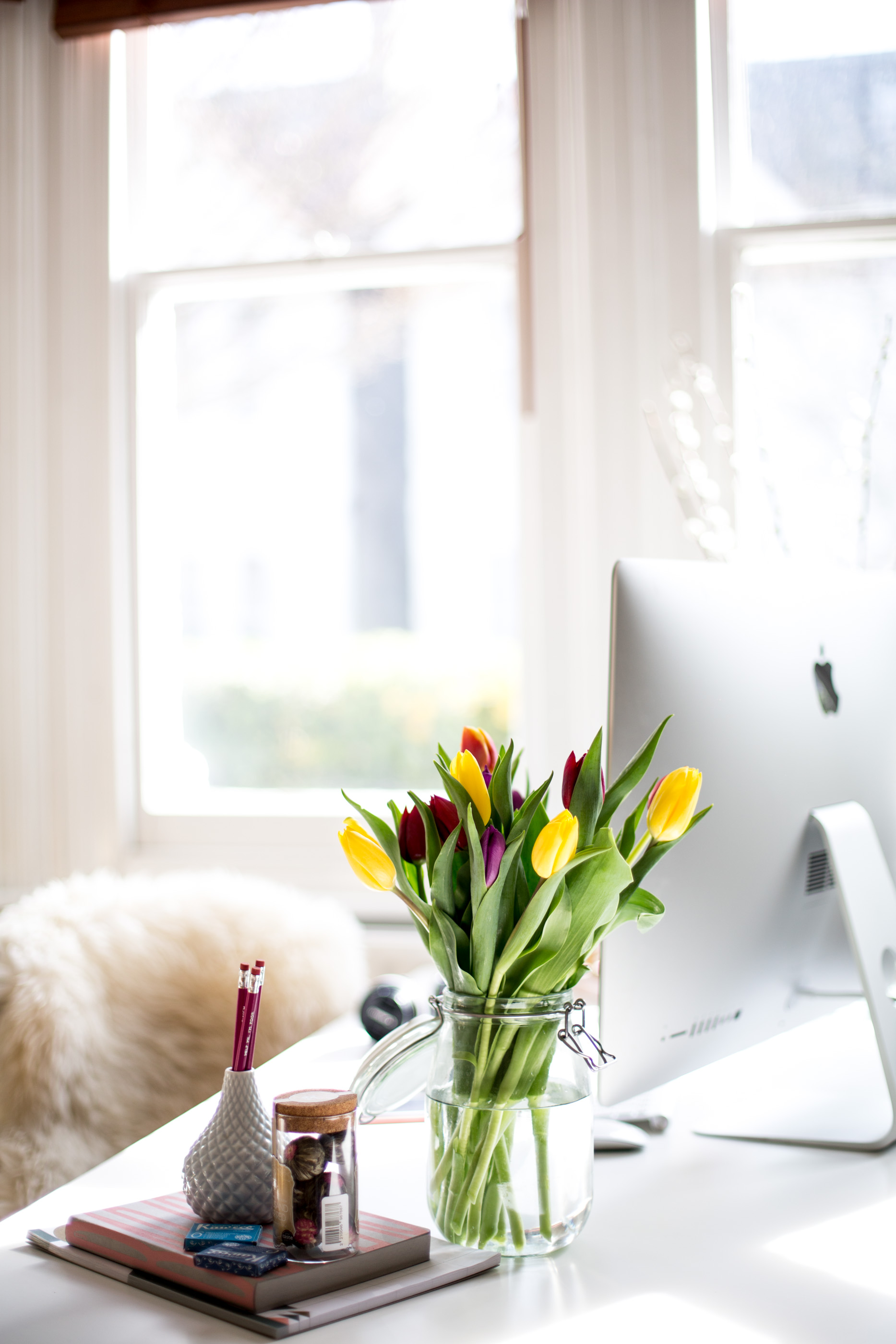
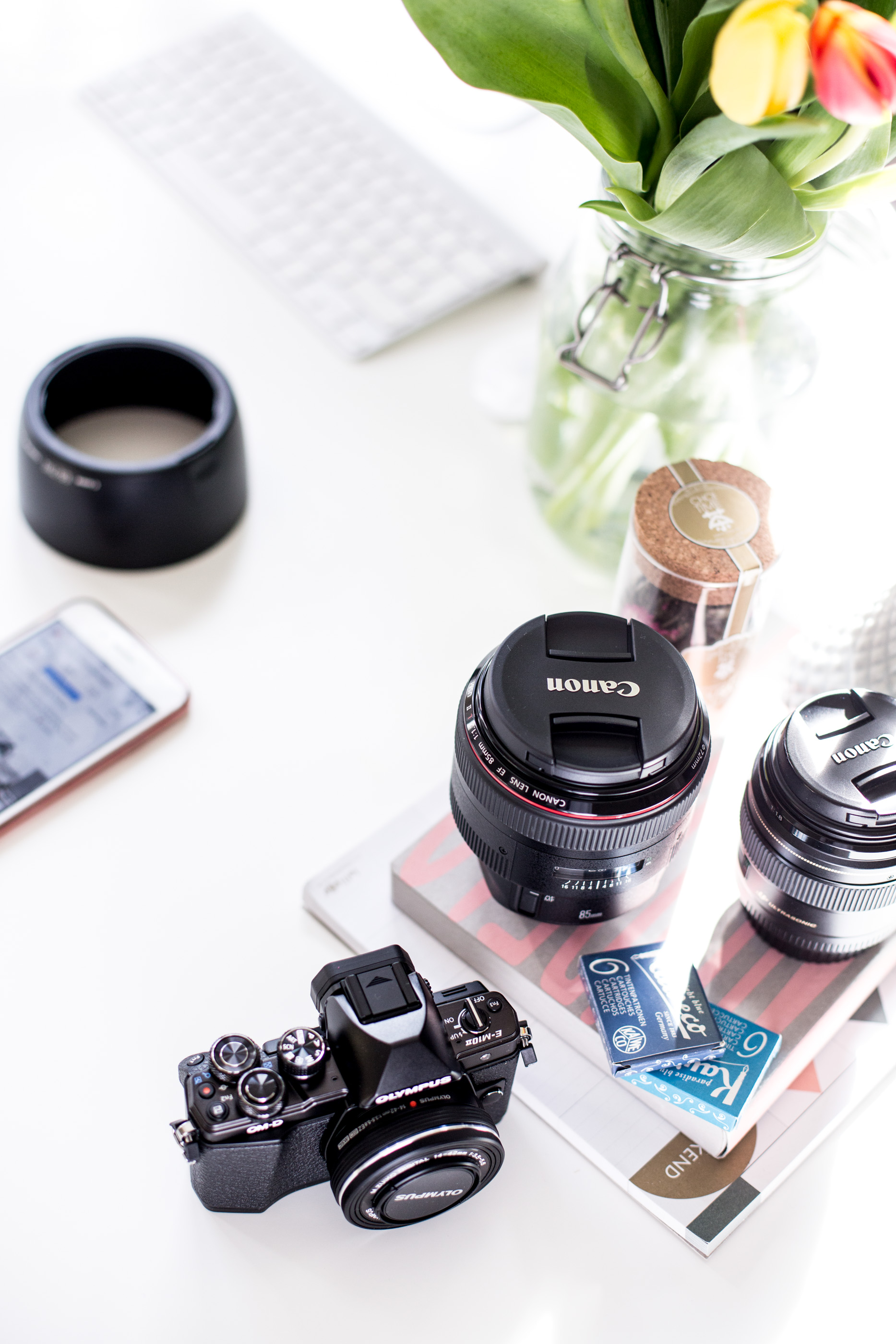
Firstly as always I wanted my blog to have a real focus on my photography and imagery, I’d already made some huge design tweaks on my last update to help ensure the imagery became a focus point, but in my latest design i’ve taken it one step further. Every page has a feature image, and now with my new Nav bar the image truly is full screen which is something I’ve wanted for a really long time. The Nav is still there, and on hover will lose it’s transparency to create a normal menu (in fact I even added a snazzy pop out menu for all the options), but for the most time the photos take centre stage. It’s a really minor change, but one that for me feels quite big and exciting.
CAREER & BLOG TIPS
So many of you tell me my career and blog tips are your favourite posts here on the blog, and some of my old tips posts still get the most views and comments on them even now. I haven’t done that many tips editorials recently, I do hope to get back into writing more on careers, blogging, photography and just general work tips soon, but in the meantime I thought it would be a great idea to give my older tips posts a little more air time on my home page. It’s a great chance for new readers to discover and read some of my all time most popular blogging tips, but also an opportunity for regular readers to discover some ‘new to me’ content from my archives.
FASHION, TRAVEL & INTERIORS
Of course travel, fashion and interiors are a huge part of this blog, and now I have a dedicated section on the home page to help you discover some of the most popular posts i’ve written in these categories. The featured posts will update over time, and will always showcase my most loved posts from these categories, a great chance to discover something new, that isn’t necessarily brand new in.
SIMPLE AESTHETICS
I’m always making tweaks here or there to my blog, from fonts, to image sizes, to new little features, and this design update is no different. Once again, nothing major, but a few aesthetic tweaks here or there to help keep things fresh. In particular I love my newly designed section headers (even if I do say myself), I was really pleased with my dual font design and glad it turned out well in reality too, I also redesigned my blog logo to strip it back a little and keep things far more simple and reflective of my own style. Often the most subtle things can make the biggest impact.
EVEN MORE DISCOVERABILITY
There’s one more pretty major update i’ve been working on and wanting for ages, but currently is in coding meltdown so isn’t quite here yet. But if nothing else i’m relentless, so I hope in time I can bring this feature to my site. It’s sole purpose is to help drive discoverability and make browsing my site super easy and effortless. In the meantime though, I’ve updated my blog posts so you can now scroll even more pieces of content you might also like at the end of this feature. Just a simple update, but one I hope makes it even more enjoyable to read and browse through my site.
EXPLORE MY NEW SITE
EXPLORE FASHION, TRAVEL, INTERIORS, CAREERS, WARDROBE & MORE
I really hope you enjoy the updates i’ve made and find it even easier to browse my content and discover something new to read. I’ve got so much content to share with you now I can finally get back into the swing of things and as ever I would absolutely love to know what content you love to read on mediamarmalade & what you’d like to see a bit more of in the future?


I love the new blog! What a great change, can’t wait to see more posts! ❤️❤️
Charmaine Ng | Architecture & Lifestyle Blog
http://charmainenyw.com
Yay! Loving this new switch up – off to have an explore now!!
Lucy | http://www.lucy-cole.co.uk
I love how simple your design is.. it’s gorgeous!
x Lisa | lisaautumn.com
The website looks amazing! I love the focus on your imagery.
Looove the design!! You totally deserve some time off but so glad you’re now back
http://www.petiteelliee.com
Ellie xx
Love your new blog!
Blonde in Cashmere
It looks gorgeous! You must be so happy with it
https://www.arabellawright.com/
Love the new clean design!
Kx